Author: admin

  • The Difference Between Student and Artist Grade Paint

    The Difference Between Student and Artist Grade Paint

    The gap between the two ranges is real, but it is not a matter of one being good and the other bad. It comes down to how much actual pigment is in the tube.

    Pigment load

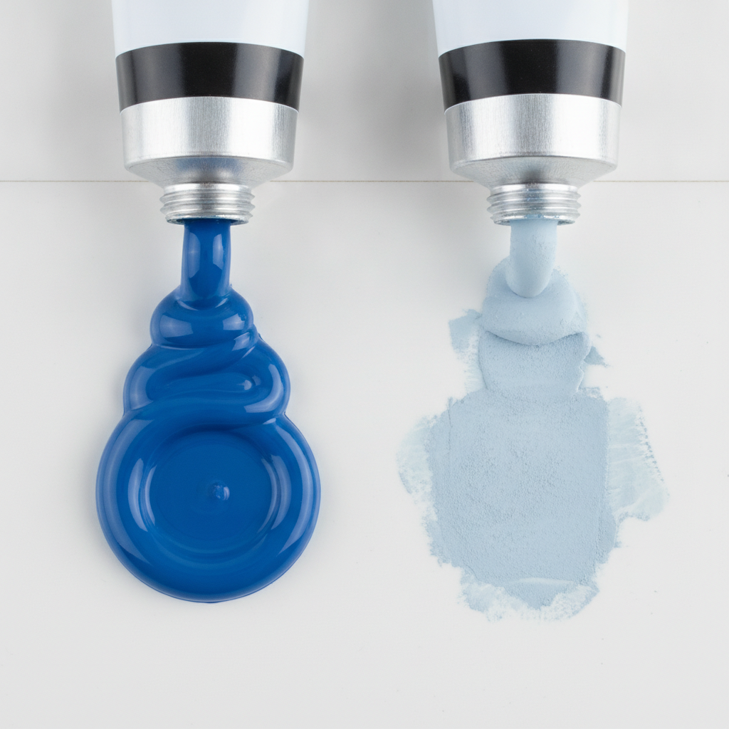
    Artist-grade paint carries more pigment and less filler. That shows up in three ways: colours reach full strength with less paint, mixtures stay clean rather than turning chalky, and a thin layer still covers.

    Student ranges bulk the paint out with extenders. The colour is still the colour, there is simply less of it per squeeze, which is why it can look weak and why mixtures drift towards grey.

    Hues and substitutions

    A colour labelled “hue” is an imitation of an expensive or discontinued pigment, mixed from cheaper ones. Some are excellent. The catch is that a hue mixes according to what is actually in it, so a cadmium red hue built from a bright organic red will behave nothing like real cadmium in a mixture.

    Check the pigment index on the tube, the PR, PB, PY codes. Two tubes with the same code from different makers will behave similarly. Two tubes with the same marketing name and different codes will not.

    Where to spend

    The sensible compromise is artist grade for the colours doing the heavy lifting, usually the two or three you reach for constantly, and student grade for everything else and for practice.

    White is worth buying properly whatever else you economise on, because it appears in a huge proportion of mixtures and a chalky white contaminates all of them.

    Consistency over time

    Student ranges are reformulated more often and discontinued more readily. If you are working on something long-running where colours must match across months, that alone is an argument for the artist range.
  • Stretching Canvas Without Warping the Frame

    Stretching Canvas Without Warping the Frame

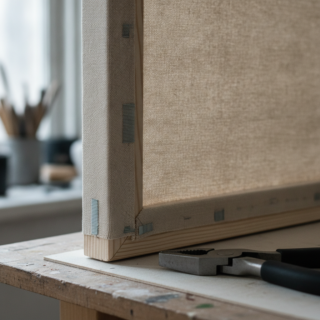
    A badly stretched canvas pulls its own stretcher bars out of square. The fault is almost always the order the staples went in rather than how hard the canvas was pulled.

    Work from the centre out

    Start with one staple at the centre of one bar. Move to the opposite bar, pull moderately, staple. Then the two remaining centres, again opposite each other. Only once all four centres are fixed do you work outwards, always alternating sides.

    Going along one bar and then the next drags the frame diagonally. That is what produces a stretcher that rocks on a flat surface, and no amount of later tightening corrects it.

    Tension

    The canvas should be taut, not drum tight. Over-tensioning bows the long bars inwards and puts permanent stress on the corners. A gentle push in the middle should give slightly.

    Raw canvas tightens as it is sized and primed, so it needs less tension at the stapling stage than feels right. Pre-primed canvas moves much less and can be pulled a little firmer.

    Corners

    Fold one side flat against the bar, then bring the other over it to make a clean diagonal. Staple through both layers. Keep every corner folded the same way so the frame is loaded evenly and the finished sides look consistent.

    Afterwards

    Check the frame is square by measuring both diagonals; they should match. If they do not, remove the staples along one bar and redo it, rather than trying to force the frame back with clamps.

    Canvas responds to humidity, so a slightly slack canvas in a damp month may tighten on its own. Corner keys exist for exactly this and should be tapped in a fraction at a time, checking the diagonals as you go.

  • Why Your Acrylics Dry Darker Than You Mixed Them

    Why Your Acrylics Dry Darker Than You Mixed Them

    Mix a colour, apply it, come back twenty minutes later and it is noticeably darker. This is normal acrylic behaviour, not a fault in the paint, and once you know why it happens it is easy to work around.

    The binder is the culprit

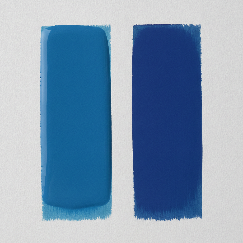
    Acrylic paint is pigment suspended in a polymer emulsion. That emulsion is milky white while wet and clear once dry. As the water leaves and the binder clarifies, it stops lightening the colour, so the pigment shows at full strength.

    The shift is largest in pale tints and mixtures containing a lot of white, because those have the most binder relative to pigment. Deep colours shift least.

    How much to allow

    Cheaper paint shifts more, because there is more filler and binder and less pigment. Artist-grade paint with a high pigment load shifts noticeably less, which is one of the practical arguments for it beyond raw intensity.

    There is no universal figure to compensate by. The only reliable method is to test the specific paint: put a stroke down, let it dry fully, and compare it against the wet mixture on the palette.

    Working with it

    Mix slightly lighter than the target if the passage must match something already dry. Keep a dried reference swatch of any colour used across several sessions, since matching wet paint on the palette to dry paint on the board is guesswork.

    A wet palette helps enormously for a different reason: it stops the mixture drying before it is used, which otherwise forces constant remixing and makes matching harder still.

    The related problem

    Acrylic also dries faster than most people expect, particularly in a warm or moving-air room. If edges are going hard before they can be blended, the answer is a retarder medium or a slower working method, not more paint.

  • A Practical Guide to Mixing Neutral Greys

    A Practical Guide to Mixing Neutral Greys

    Tube greys are convenient and nearly always flat. A mixed grey carries a hint of the colours that made it, which is what lets it sit believably next to everything else in a painting.

    Complements first

    The standard route is to mix a colour with its opposite. Blue with orange, red with green, yellow with purple. As the mixture approaches equal strength the colour drains out and you are left with a grey that still leans slightly one way.

    That lean is the useful part. A grey mixed from ultramarine and burnt sienna leans cool or warm depending on the ratio, and can be pushed either way in the middle of a passage without changing pigments.

    The reliable pair

    Ultramarine and burnt sienna is the workhorse. Both are widely available, both are reasonably transparent, and between them they cover almost every grey needed for shadow. Add water for a pale atmospheric grey, use it thick for something close to black.

    Phthalo blue with burnt umber gives a colder, harder grey with more staining power. Useful, but phthalo takes over quickly, so add it to the umber rather than the other way round.

    Why mixtures go muddy

    Mud is usually three or more pigments fighting, particularly when one is opaque and heavily filled. Two pigments plus water almost never goes muddy. Three sometimes does. Four nearly always does.

    The other cause is disturbing a layer that has not dried, lifting the pigment underneath into the one above. That is a timing problem rather than a colour problem, and no amount of remixing will fix it.

    Testing properly

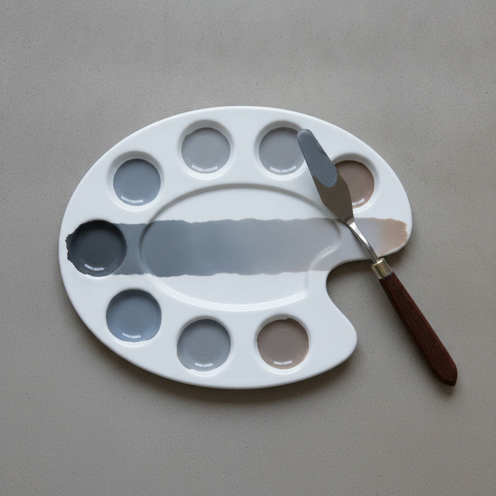
    Mix a strip that runs from one parent colour through neutral to the other, on the paper you actually use, and keep it. Greys look completely different on cream stock than on bright white, and a swatch made on scrap tells you very little about the finished piece.

  • Understanding Paper Weight and Tooth

    Understanding Paper Weight and Tooth

    Paper is the material most likely to be blamed for a failure that it did not cause, and the one most people spend least time choosing. Two properties explain most of its behaviour: how heavy it is, and how rough.

    Weight

    Weight is given in grams per square metre or pounds per ream. What it really tells you is how much water the sheet can take before it buckles. Around 300gsm is the point at which a sheet will handle generous wet work without stretching, which is why it is the default for watercolour.

    Lighter paper is not worse, it simply needs support. A 190gsm sheet taped down on a board behaves far better than a heavy sheet left loose, and costs a fraction as much for practice.

    Tooth

    Tooth is the texture of the surface. Rough paper has pronounced valleys that catch pigment and leave sparkle in a fast stroke. Hot pressed is nearly smooth, so washes sit evenly and fine detail stays crisp. Cold pressed sits between the two and is the sensible default.

    Dry media care about tooth even more than wet. Charcoal and pastel need something for the particles to grip; on smooth paper they slide and refuse to build up.

    Sizing, the invisible one

    Sizing is the treatment that controls how much liquid soaks in. Heavily sized paper keeps the wash sitting on top for longer, which allows lifting and reworking. Lightly sized paper drinks it straight down, so marks are immediate and permanent.

    This is usually the real cause of the complaint that a paper is “muddy” or that colour “goes dull”. The pigment has sunk below the surface where light no longer reflects off it cleanly.

    Choosing without buying everything

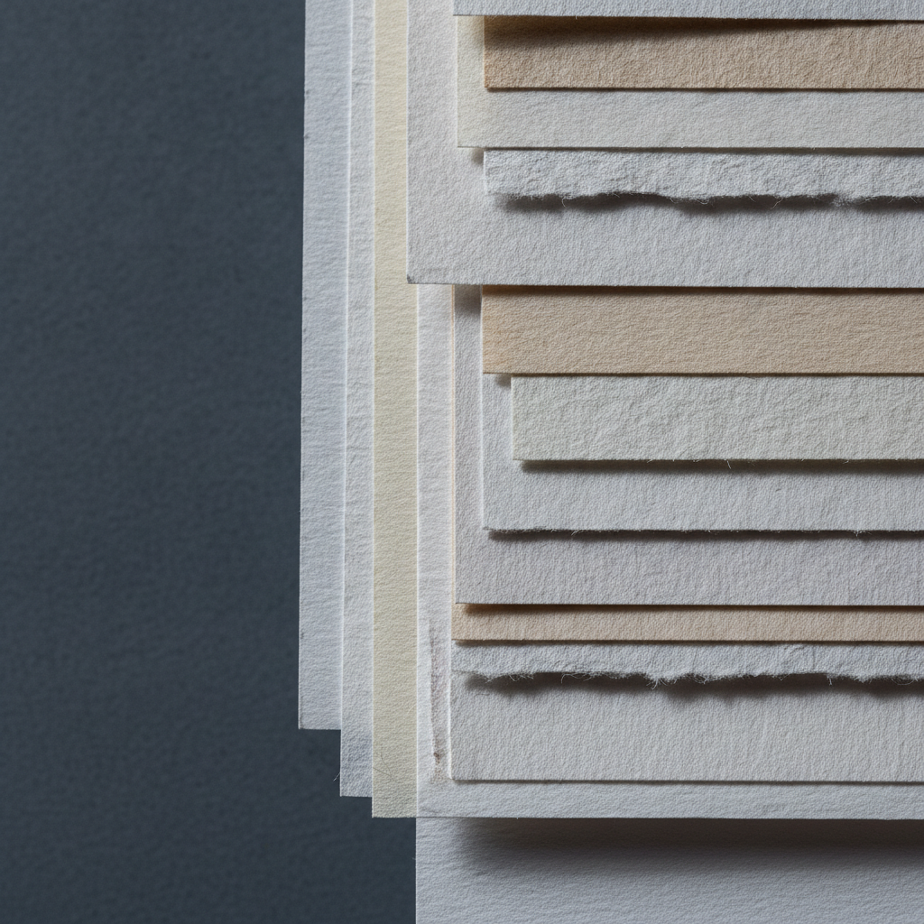
    Sample packs are the cheapest education available. Take one sheet of each, do the same simple exercise on all of them, a graded wash, a lifted highlight, a dry stroke, and label them. An afternoon of that teaches more than any amount of reading, this article included.

  • How to Choose a Watercolour Brush That Lasts

    How to Choose a Watercolour Brush That Lasts

    A watercolour brush has one job that matters more than any other: hold a lot of water, then give it back slowly and under control. Almost everything else people look at when buying one is secondary to that.

    The point, and why it forms

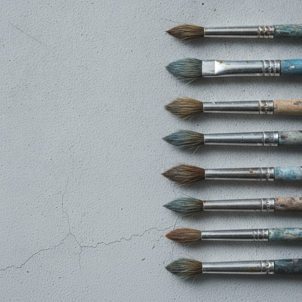
    A good round comes to a point because the individual hairs taper. They are not cut to shape. That is the difference between a brush that keeps its point for years and one that goes fluffy after a month, and it is also most of the price difference.

    In a shop, the standard test is to wet the brush and flick it once. It should snap to a point with no stray hairs. Dry brushes in packaging tell you very little, since they are usually stiffened with gum that washes out on first use.

    Natural hair against synthetic

    Natural hair, particularly sable, holds more water and releases it gradually. That gives long, even washes and a stroke that keeps going. Good synthetics have improved enormously and have more spring, which suits precise marks and drybrush work, but most still dump their water faster.

    The practical answer for most people is a mixed set: natural hair for washes and anything that needs a long continuous stroke, synthetic for detail and for anything abrasive.

    Size, and the usual mistake

    Beginners buy brushes that are too small. A size 10 or 12 round with a decent point will do fine detail perfectly well, because the point is the point regardless of the belly behind it. What a large brush gives you is the water capacity to cross a whole sheet without going back to the palette, which is exactly what small brushes cannot do.

    Two or three brushes chosen well will outperform a set of twelve. A large round, a medium round and a flat for wetting and lifting covers most work.

    Making them last

    Never leave a brush standing in water. The hairs bend permanently and the ferrule loosens as the glue softens. Wash with lukewarm water, reshape the point with your fingers, and dry flat or hanging down.

    Soap is only needed occasionally, and hot water never. If a brush has lost its point but the hairs are intact, a wash and reshape while damp will often bring it back.