Author: admin

  • Printmaking at Home With Minimal Equipment

    Printmaking has a reputation for needing a press and a dedicated room. Relief printing needs neither, and it is the most rewarding way into the subject.

    Start with relief

    Lino or soft carving blocks, a set of cutters, water-based relief ink, a brayer and a smooth surface to roll out on. That is the entire kit and it fits in a drawer.

    Soft blocks cut easily and suit bold shapes. Traditional lino resists more, holds finer detail, and is much easier to work if warmed slightly first.

    Printing without a press

    Ink the block thinly, lay the paper on top, and burnish the back with the bowl of a wooden spoon or a baren, working in small circles. Lift one corner to check coverage before committing.

    Thin, smooth paper transfers far better by hand than thick textured stock. Heavy watercolour paper is exactly the wrong choice here, which surprises people.

    Ink consistency

    Most failed prints are over-inked. The roller should sound tacky, and the block should look satin rather than wet. Thick ink fills the cut lines and blurs every edge.

    Safety and cleanup

    Cut away from your hand, always, and use a bench hook so the block cannot slide. Carving tools are sharp enough that a slip goes deep.

    Water-based inks wash off with soap and water, which is the main argument for them at home. Oil-based inks print more richly and need solvent, so they are worth it only once you have somewhere ventilated to clean up.
  • Sketchbook Paper and the Bleed-Through Problem

    Bleed-through is the commonest complaint about sketchbooks and it is nearly always a mismatch between the paper and the medium rather than a defective book.

    Why it happens

    Alcohol markers carry a lot of solvent that travels sideways and downwards through the sheet. Most sketchbook paper is 100 to 160gsm and cannot stop it. This is normal behaviour, not a fault.

    Fineliners and ballpoints rarely bleed but can emboss the next page. Water-based media do not usually bleed but will cockle a light sheet badly.

    Matching paper to medium

    For markers, use marker paper or a book of at least 250gsm with heavy sizing, and accept that even then the reverse of the sheet is lost. For ink and light washes, 160 to 200gsm is comfortable. For anything genuinely wet, you want watercolour paper and a book that lies flat.

    Working around it

    The simplest fix is a loose sheet of scrap behind the working page, which catches the bleed and protects the rest of the book.

    The other approach is to accept it and use one side only. It halves the pages and removes the anxiety, and the ghost image on the reverse stops being a problem the moment you decide not to draw there.

    Binding matters too

    A book that will not stay open makes wet work impossible. Spiral binding lies flat but interrupts across the spread. Sewn bindings open reasonably flat once broken in. Glued blocks are the worst of both and are best avoided for anything but quick sketching.

  • Setting Up a Small Studio in a Shared Room

    Most people work in a room that is also something else. The constraint is not space so much as the cost of setting up and putting away, because anything that takes fifteen minutes to prepare will not get used on a short evening.

    Reduce the setup cost

    The aim is to be working within two minutes. A board that lives ready with paper taped to it, a palette that closes with the paint still in it, and a single container of water do more for output than any amount of extra space.

    A wet palette is particularly valuable here, because it removes the need to remix from scratch each session.

    Light

    Consistent light matters more than abundant light. Working under a warm bulb one evening and daylight the next makes colour decisions unreliable, and it is invisible until you compare the results.

    One decent daylight-balanced lamp positioned to the side of your working hand solves both the colour and the shadow problem cheaply.

    Containing the mess

    The realistic worry in a shared room is damage. A sheet of hardboard as a work surface, a lidded water container and a rule about where solvents may be opened will prevent nearly all of it.

    Aerosols, fixative included, should not be used indoors in a room people live in. That is a genuine health point, not a tidiness one.

    Drying and storage

    Drying space is the constraint nobody plans for. A wire rack or a few bulldog clips on a line handles it in almost no floor area.

    Store finished work flat and interleaved. Rolling paper introduces a curl that never fully comes out and makes framing harder later.

  • Colour Temperature, and Why Warm and Cool Mislead Beginners

    Warm and cool are useful shorthand and actively confusing when treated as fixed properties. Temperature is relative, always.

    Relative, not absolute

    Ultramarine is a cool colour in general terms, and distinctly warm next to phthalo blue. Cadmium red is warm, and cool beside a bright orange. The label describes a comparison, not the pigment.

    This is why “use cool colours for shadows” fails so often. What matters is whether a passage is cooler than the one beside it, not whether it appears on the cool side of a colour wheel.

    Where it comes from

    Each primary leans towards one of its neighbours. A yellow leaning green behaves differently in mixtures from one leaning orange, and knowing which way each of your tubes leans predicts your mixtures more reliably than any rule about temperature.

    Using it deliberately

    The reliable application is contrast within a single object. A warm light usually implies a cool shadow, and holding that relationship makes form read even when the values are close together.

    Across a whole picture, keeping most of it in one temperature and letting a small area oppose it gives the opposition somewhere to work. When everything is contrasted against everything else, nothing stands out.

    Testing your own paints

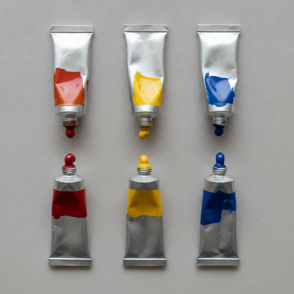
    Lay every tube you own in a row and compare them against each other rather than against a chart. The ones that surprise you, and there are usually two or three, are the ones that have been quietly ruining mixtures.

  • Choosing a Surface for Oil Pastel

    Oil pastel never fully dries. Whatever it is applied to has to cope with a soft, oily layer indefinitely, and that rules out a lot of ordinary paper.

    The oil problem

    The binder migrates into unprimed paper over time, leaving a translucent halo around every mark and eventually weakening the sheet. Sized or primed surfaces stop this, which is why oil pastel paper is coated and why an acrylic-primed board works well.

    Tooth

    Oil pastel needs a surface with grip, but not the aggressive tooth used for soft pastel, which shreds the stick and clogs immediately. A moderate texture holds several layers without filling in on the first pass.

    Sanded pastel papers are usually too coarse. Canvas boards, primed panels and heavyweight coated papers all work.

    Colour of the ground

    Oil pastel is semi-opaque, so the ground shows through and influences everything. A mid-toned ground is far more forgiving than white, since both lights and darks read immediately, and it saves covering the whole surface just to establish a value.

    Layering and blending

    Build light pressure first. Heavy early layers fill the tooth and nothing else will stick. Blending with a finger works but warms the pastel and can turn a passage greasy; a colour shaper or a stiff brush gives more control.

    Finishing and storage

    Finished work stays soft, so it must be framed under glass with a spacer to keep it off the surface, or interleaved with glassine in storage. Ordinary fixative does very little; a specific oil pastel fixative helps slightly but does not make the surface touch-safe.

  • Drawing With Compressed Charcoal Versus Vine

    Drawing With Compressed Charcoal Versus Vine

    The two look similar in the box and behave like different media. Choosing the wrong one for the stage of a drawing accounts for a great deal of unnecessary frustration.

    Vine and willow

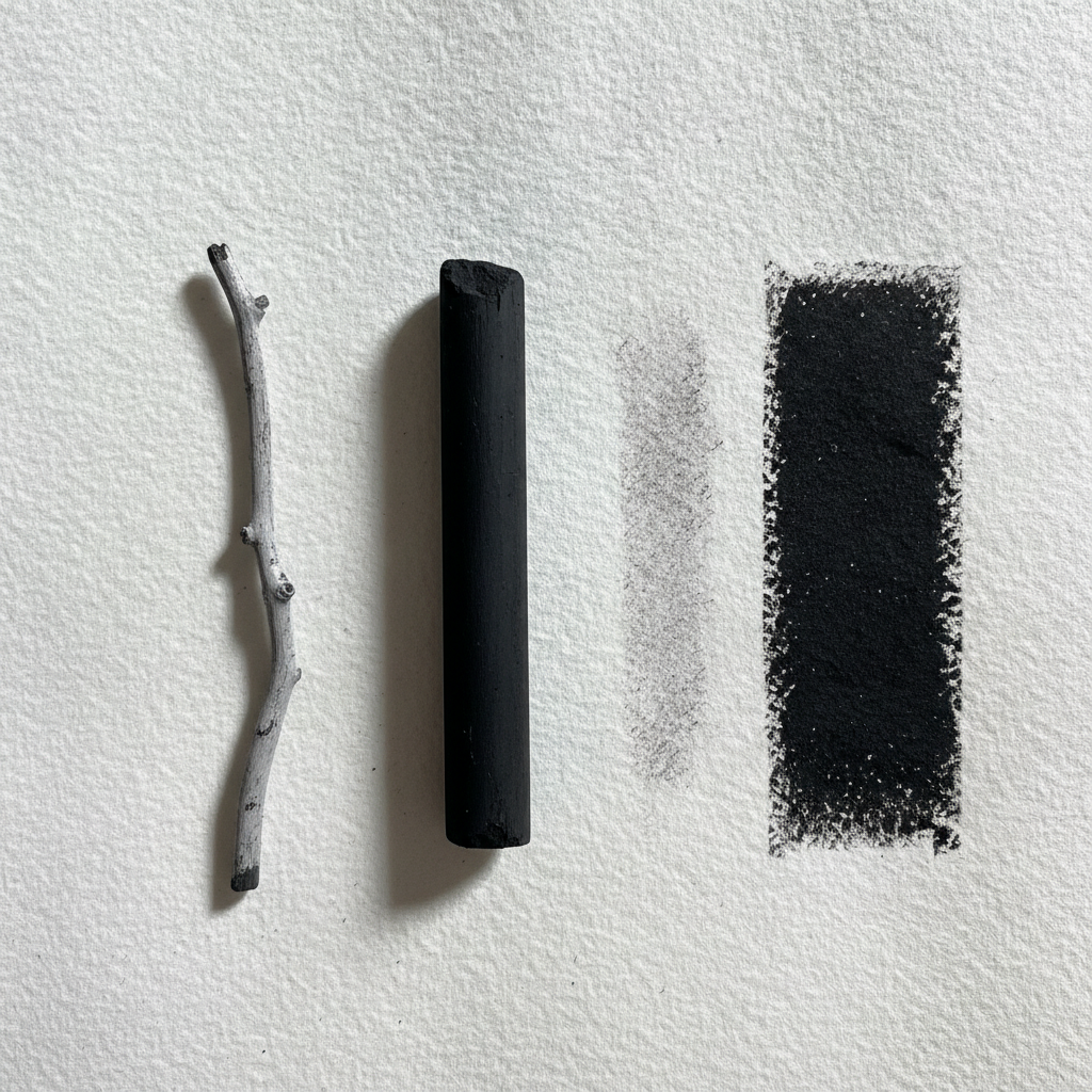
    Burnt twigs, essentially: light, dusty and barely attached to the paper. They lift almost completely with a cloth, which makes them ideal for the searching stage of a drawing where everything is provisional.

    The limitation is depth. Vine will not give a true black. Pushed hard it silvers and skids rather than darkening.

    Compressed

    Powdered charcoal held together with a binder. It is dense, goes very dark, and grips the paper. That makes it right for finishing, for the darkest accents and for anything that must survive handling.

    It is also close to permanent. Compressed charcoal in the wrong place will not fully erase, and the ghost stays visible in the finished drawing.

    Using them together

    The standard sequence is vine for construction, then compressed once the drawing is settled. Working the other way round means committing before you know where anything goes.

    A kneaded eraser is the natural partner to both. It lifts rather than abrades, so it can pull a highlight out of a dark passage without destroying the tooth of the paper.

    Paper and fixing

    Both need tooth. On smooth paper charcoal sits on the surface and smears at the first contact.

    Fixative darkens the drawing slightly and reduces the very lightest marks, so it is worth allowing for that before spraying. Light passes from a distance, several of them, beat one heavy pass that floods the surface and pools in the darks.

  • How to Varnish an Acrylic Painting Properly

    How to Varnish an Acrylic Painting Properly

    Varnishing protects the surface and evens out the patchy sheen that acrylic leaves. Done carelessly it is also the most reliable way to ruin a finished piece.

    Wait longer than you think

    Acrylic is touch dry in minutes and fully cured in weeks. Varnishing before the film has cured traps solvent and water underneath, which produces cloudiness that cannot be removed.

    Two weeks is a reasonable minimum for a normal thickness. Heavy impasto needs considerably longer.

    Isolation coat first

    An isolation coat of clear acrylic medium goes between the painting and the varnish. It seals the surface so that if the varnish is ever removed, the removal solvent cannot reach the paint.

    Without it, a removable varnish is not really removable, because taking it off takes some of the painting with it.

    Applying it

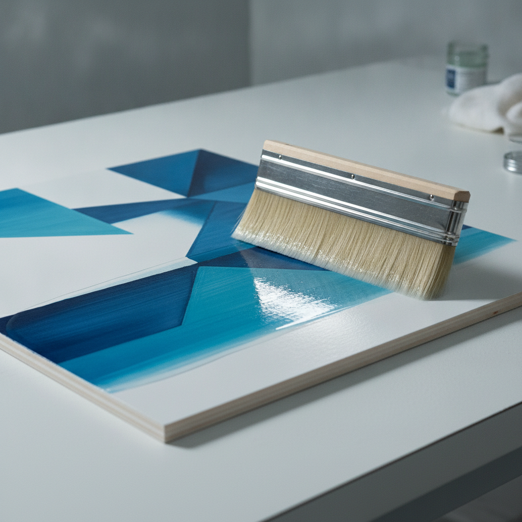
    Work flat, in a dust-free room, with the piece well lit from the side so you can see where you have been. Use a wide soft brush and lay the varnish in one direction in overlapping strokes without going back over a section that has started to set.

    Two thin coats beat one thick one, with the second at right angles to the first. Thick varnish pools at edges and stays tacky in the middle.

    Choosing the finish

    Gloss deepens colour and raises contrast. Matte flattens both and can slightly haze dark passages, since the matting agent is a suspended solid. Satin is the usual compromise. Whichever you choose, stir rather than shake, because bubbles dry in place.

    Testing

    Always test on a scrap prepared the same way, including the isolation coat. Varnish over an untested surface is a decision you cannot reverse.

  • Gouache for People Who Already Paint in Watercolour

    Gouache for People Who Already Paint in Watercolour

    Gouache looks like watercolour in the tube and behaves quite differently on paper. For anyone arriving from watercolour, three differences matter.

    It is opaque

    Gouache covers what is underneath. Light over dark works, which is the single largest change: highlights can be added at the end instead of being reserved from the start, and mistakes can be painted over rather than lifted.

    That freedom removes most of the planning anxiety of watercolour, and removes the luminosity that comes from white paper glowing through a transparent layer. It is a trade, not an upgrade.

    It rewets

    Dried gouache dissolves again when wet paint touches it. Working in layers means either working fast and leaving the layer below alone, or accepting that the edges will blend into each other.

    This is also why gouache is forgiving in the sketchbook. Dried paint on the palette rewets perfectly, so nothing is wasted between sessions.

    It dries with a value shift

    Gouache dries matte and the value shifts, darks lightening slightly and lights sometimes darkening. Test on scrap before matching an existing passage, exactly as with acrylic.

    Practical starting point

    Use heavier paper than feels necessary, since gouache goes on wetter than expected. Keep the mixtures thicker than watercolour, roughly the consistency of cream, because thin gouache loses its opacity and simply becomes weak watercolour.

    A small palette works particularly well here: gouache mixes cleanly and adding white to everything already unifies the range.

  • Caring for Natural Hair Brushes

    Caring for Natural Hair Brushes

    A good natural hair brush should outlast several synthetics. Most die early, and almost always from one of a small number of avoidable habits.

    The ferrule is the weak point

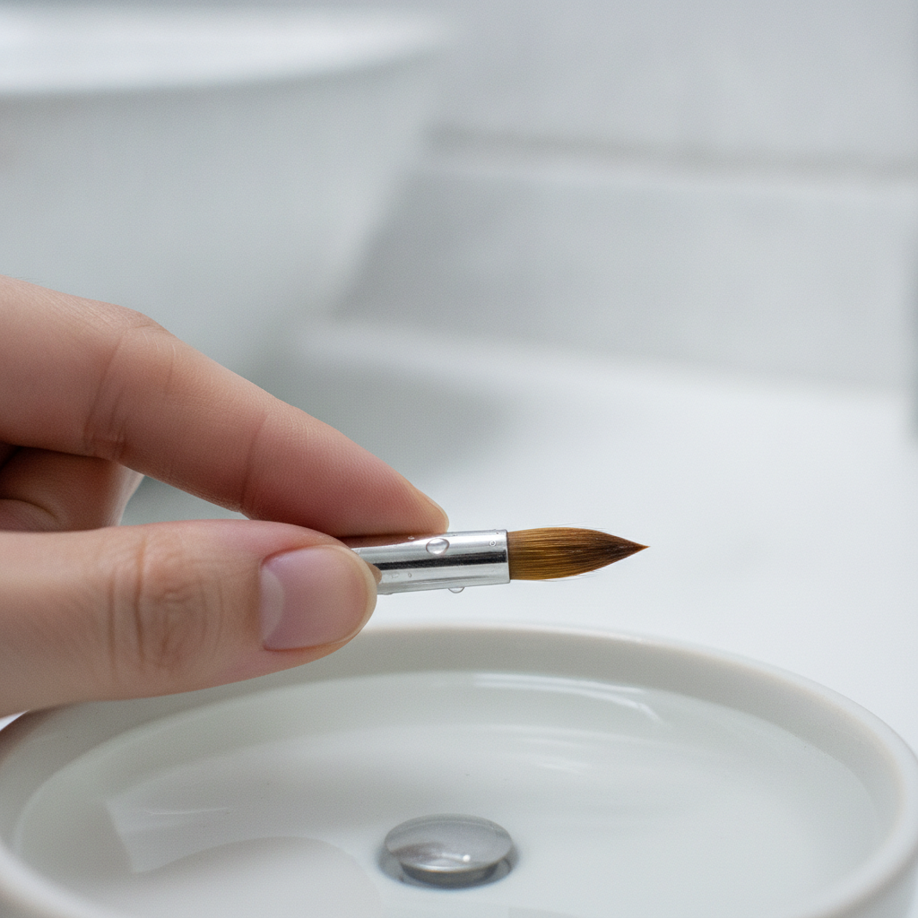
    Paint that works up into the metal ferrule dries there, spreads the hairs at the base and forces the brush to splay permanently. No amount of cleaning the tip fixes it once it has happened.

    So do not load paint past the belly of the brush, and when washing, work from the ferrule outwards rather than jamming the brush into the bottom of a jar.

    Water temperature

    Lukewarm at most. Hot water softens the adhesive holding the hairs and expands the ferrule slightly, and repeated exposure loosens the whole head. It also strips the natural oils that give sable its spring.

    Storage

    Flat, or hanging bristles down. Standing a brush upright in a pot lets residual water run into the ferrule, which is the slow version of the problem above.

    If brushes are stored in a closed roll, they must be completely dry first. Damp hair in an enclosed space grows mould, and moths are genuinely attracted to natural hair.

    Reshaping

    Reshape the point with your fingers while damp and let it dry that way. For a brush that has lost its shape, a little gum arabic or brush soap worked in and left to dry will hold the point; wash it out before the next use.

    Acrylic is different

    Acrylic dries in the brush and is effectively permanent once it has. If you use natural hair with acrylic, keep it wet continuously and clean it immediately. Most people are better off using synthetics for acrylic and saving natural hair for watercolour, which is what it is suited to anyway.

  • Building a Limited Palette That Actually Works

    Building a Limited Palette That Actually Works

    A limited palette is not about self-denial. It is about mixtures that relate to each other, which is what makes a painting look coherent rather than assembled from unrelated parts.

    Warm and cool of each primary

    The most flexible small palette is six: a warm and a cool version of red, yellow and blue. That gives clean secondaries in both directions, because you can pick the two parents that both lean towards the target.

    Mixing a clean violet needs a red and a blue that both lean towards violet. Use a yellow-leaning red instead and the result is muddy, which is the usual reason people conclude they cannot mix purple.

    Add earths, not more brights

    Once six primaries are in place, the useful additions are earth colours: burnt sienna, yellow ochre, raw umber. They knock colours back believably and mix the greys that hold a painting together.

    Adding another bright, a second green or a fourth blue, tends to make things worse. It gives another option without giving another relationship.

    Learn it before extending it

    Mix a full chart, every colour against every other, and keep it. It is tedious and it removes most of the guesswork permanently. Nothing else shortens the gap between imagining a colour and mixing it.

    Where it fails

    Some pigments cannot be mixed. A genuinely intense phthalo green, a fluorescent, certain deep violets: no combination of primaries reaches them. If your subject needs one, buy it and treat it as a special case rather than trying to approximate it and accepting something dull.