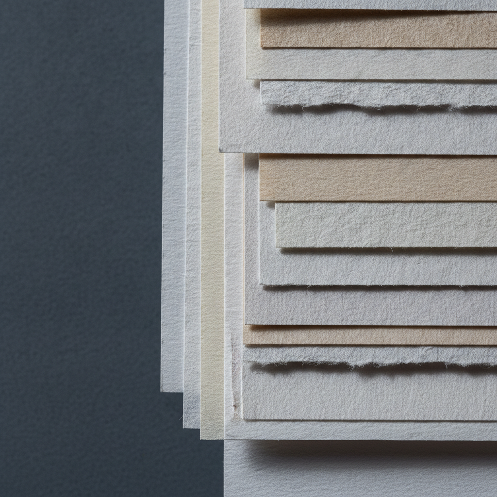
Paper is the material most likely to be blamed for a failure that it did not cause, and the one most people spend least time choosing. Two properties explain most of its behaviour: how heavy it is, and how rough.
Weight
Weight is given in grams per square metre or pounds per ream. What it really tells you is how much water the sheet can take before it buckles. Around 300gsm is the point at which a sheet will handle generous wet work without stretching, which is why it is the default for watercolour.
Lighter paper is not worse, it simply needs support. A 190gsm sheet taped down on a board behaves far better than a heavy sheet left loose, and costs a fraction as much for practice.
Tooth
Tooth is the texture of the surface. Rough paper has pronounced valleys that catch pigment and leave sparkle in a fast stroke. Hot pressed is nearly smooth, so washes sit evenly and fine detail stays crisp. Cold pressed sits between the two and is the sensible default.
Dry media care about tooth even more than wet. Charcoal and pastel need something for the particles to grip; on smooth paper they slide and refuse to build up.
Sizing, the invisible one
Sizing is the treatment that controls how much liquid soaks in. Heavily sized paper keeps the wash sitting on top for longer, which allows lifting and reworking. Lightly sized paper drinks it straight down, so marks are immediate and permanent.
This is usually the real cause of the complaint that a paper is “muddy” or that colour “goes dull”. The pigment has sunk below the surface where light no longer reflects off it cleanly.
Choosing without buying everything
Sample packs are the cheapest education available. Take one sheet of each, do the same simple exercise on all of them, a graded wash, a lifted highlight, a dry stroke, and label them. An afternoon of that teaches more than any amount of reading, this article included.
Leave a Reply