Category: Studio Practice

  • Sketchbook Paper and the Bleed-Through Problem

    Bleed-through is the commonest complaint about sketchbooks and it is nearly always a mismatch between the paper and the medium rather than a defective book.

    Why it happens

    Alcohol markers carry a lot of solvent that travels sideways and downwards through the sheet. Most sketchbook paper is 100 to 160gsm and cannot stop it. This is normal behaviour, not a fault.

    Fineliners and ballpoints rarely bleed but can emboss the next page. Water-based media do not usually bleed but will cockle a light sheet badly.

    Matching paper to medium

    For markers, use marker paper or a book of at least 250gsm with heavy sizing, and accept that even then the reverse of the sheet is lost. For ink and light washes, 160 to 200gsm is comfortable. For anything genuinely wet, you want watercolour paper and a book that lies flat.

    Working around it

    The simplest fix is a loose sheet of scrap behind the working page, which catches the bleed and protects the rest of the book.

    The other approach is to accept it and use one side only. It halves the pages and removes the anxiety, and the ghost image on the reverse stops being a problem the moment you decide not to draw there.

    Binding matters too

    A book that will not stay open makes wet work impossible. Spiral binding lies flat but interrupts across the spread. Sewn bindings open reasonably flat once broken in. Glued blocks are the worst of both and are best avoided for anything but quick sketching.

  • Choosing a Surface for Oil Pastel

    Oil pastel never fully dries. Whatever it is applied to has to cope with a soft, oily layer indefinitely, and that rules out a lot of ordinary paper.

    The oil problem

    The binder migrates into unprimed paper over time, leaving a translucent halo around every mark and eventually weakening the sheet. Sized or primed surfaces stop this, which is why oil pastel paper is coated and why an acrylic-primed board works well.

    Tooth

    Oil pastel needs a surface with grip, but not the aggressive tooth used for soft pastel, which shreds the stick and clogs immediately. A moderate texture holds several layers without filling in on the first pass.

    Sanded pastel papers are usually too coarse. Canvas boards, primed panels and heavyweight coated papers all work.

    Colour of the ground

    Oil pastel is semi-opaque, so the ground shows through and influences everything. A mid-toned ground is far more forgiving than white, since both lights and darks read immediately, and it saves covering the whole surface just to establish a value.

    Layering and blending

    Build light pressure first. Heavy early layers fill the tooth and nothing else will stick. Blending with a finger works but warms the pastel and can turn a passage greasy; a colour shaper or a stiff brush gives more control.

    Finishing and storage

    Finished work stays soft, so it must be framed under glass with a spacer to keep it off the surface, or interleaved with glassine in storage. Ordinary fixative does very little; a specific oil pastel fixative helps slightly but does not make the surface touch-safe.

  • Gouache for People Who Already Paint in Watercolour

    Gouache for People Who Already Paint in Watercolour

    Gouache looks like watercolour in the tube and behaves quite differently on paper. For anyone arriving from watercolour, three differences matter.

    It is opaque

    Gouache covers what is underneath. Light over dark works, which is the single largest change: highlights can be added at the end instead of being reserved from the start, and mistakes can be painted over rather than lifted.

    That freedom removes most of the planning anxiety of watercolour, and removes the luminosity that comes from white paper glowing through a transparent layer. It is a trade, not an upgrade.

    It rewets

    Dried gouache dissolves again when wet paint touches it. Working in layers means either working fast and leaving the layer below alone, or accepting that the edges will blend into each other.

    This is also why gouache is forgiving in the sketchbook. Dried paint on the palette rewets perfectly, so nothing is wasted between sessions.

    It dries with a value shift

    Gouache dries matte and the value shifts, darks lightening slightly and lights sometimes darkening. Test on scrap before matching an existing passage, exactly as with acrylic.

    Practical starting point

    Use heavier paper than feels necessary, since gouache goes on wetter than expected. Keep the mixtures thicker than watercolour, roughly the consistency of cream, because thin gouache loses its opacity and simply becomes weak watercolour.

    A small palette works particularly well here: gouache mixes cleanly and adding white to everything already unifies the range.

  • The Difference Between Student and Artist Grade Paint

    The Difference Between Student and Artist Grade Paint

    The gap between the two ranges is real, but it is not a matter of one being good and the other bad. It comes down to how much actual pigment is in the tube.

    Pigment load

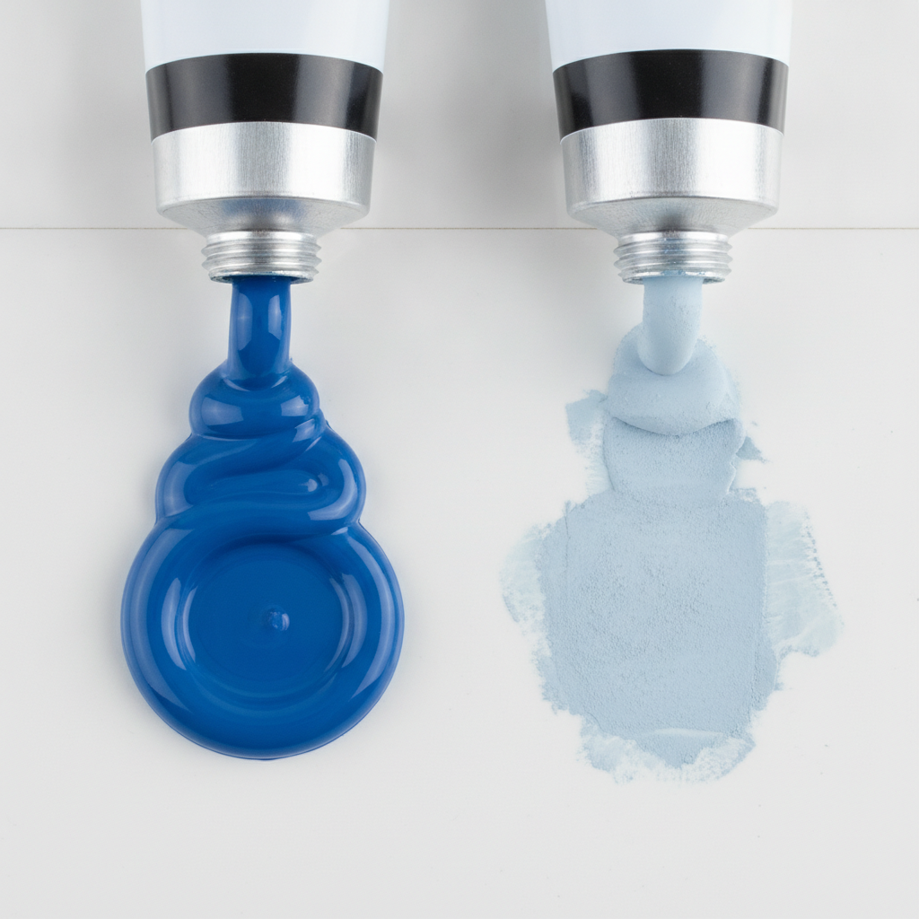
    Artist-grade paint carries more pigment and less filler. That shows up in three ways: colours reach full strength with less paint, mixtures stay clean rather than turning chalky, and a thin layer still covers.

    Student ranges bulk the paint out with extenders. The colour is still the colour, there is simply less of it per squeeze, which is why it can look weak and why mixtures drift towards grey.

    Hues and substitutions

    A colour labelled “hue” is an imitation of an expensive or discontinued pigment, mixed from cheaper ones. Some are excellent. The catch is that a hue mixes according to what is actually in it, so a cadmium red hue built from a bright organic red will behave nothing like real cadmium in a mixture.

    Check the pigment index on the tube, the PR, PB, PY codes. Two tubes with the same code from different makers will behave similarly. Two tubes with the same marketing name and different codes will not.

    Where to spend

    The sensible compromise is artist grade for the colours doing the heavy lifting, usually the two or three you reach for constantly, and student grade for everything else and for practice.

    White is worth buying properly whatever else you economise on, because it appears in a huge proportion of mixtures and a chalky white contaminates all of them.

    Consistency over time

    Student ranges are reformulated more often and discontinued more readily. If you are working on something long-running where colours must match across months, that alone is an argument for the artist range.

  • A Practical Guide to Mixing Neutral Greys

    A Practical Guide to Mixing Neutral Greys

    Tube greys are convenient and nearly always flat. A mixed grey carries a hint of the colours that made it, which is what lets it sit believably next to everything else in a painting.

    Complements first

    The standard route is to mix a colour with its opposite. Blue with orange, red with green, yellow with purple. As the mixture approaches equal strength the colour drains out and you are left with a grey that still leans slightly one way.

    That lean is the useful part. A grey mixed from ultramarine and burnt sienna leans cool or warm depending on the ratio, and can be pushed either way in the middle of a passage without changing pigments.

    The reliable pair

    Ultramarine and burnt sienna is the workhorse. Both are widely available, both are reasonably transparent, and between them they cover almost every grey needed for shadow. Add water for a pale atmospheric grey, use it thick for something close to black.

    Phthalo blue with burnt umber gives a colder, harder grey with more staining power. Useful, but phthalo takes over quickly, so add it to the umber rather than the other way round.

    Why mixtures go muddy

    Mud is usually three or more pigments fighting, particularly when one is opaque and heavily filled. Two pigments plus water almost never goes muddy. Three sometimes does. Four nearly always does.

    The other cause is disturbing a layer that has not dried, lifting the pigment underneath into the one above. That is a timing problem rather than a colour problem, and no amount of remixing will fix it.

    Testing properly

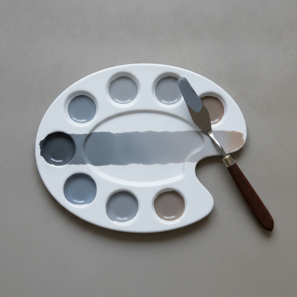
    Mix a strip that runs from one parent colour through neutral to the other, on the paper you actually use, and keep it. Greys look completely different on cream stock than on bright white, and a swatch made on scrap tells you very little about the finished piece.